The Power of Color and Contrast
This week, we’re diving into color—how it shapes a room, sets the tone, and adds that unexpected layer that makes a space feel intentional. From a Paris apartment saturated in jewel tones to a lesson in complementary palettes, we’re exploring the ways color creates cohesion, contrast, and charm. Whether it’s a pop of red or the quiet tension between teal and tangerine, great color moments rarely happen by accident. They’re bold, balanced, and rooted in good design.


Insight: The Versatility of Color Theory
Color is one of the most powerful tools in a designer’s toolkit. It shapes mood, sets the tone, and adds intention to every room. When used thoughtfully, color doesn’t just decorate—it directs. Whether you’re layering complementary hues or adding a single bold accent, the goal is balance, contrast, and emotional resonance. The right shade can ground a space, energize it, or give it an edge of the unexpected.
A few helpful tips:

Start with the 80/20 rule:
80% of a room should be neutral or grounding, while the remaining 20% can be a pop—something bold, unexpected, or layered with meaning.
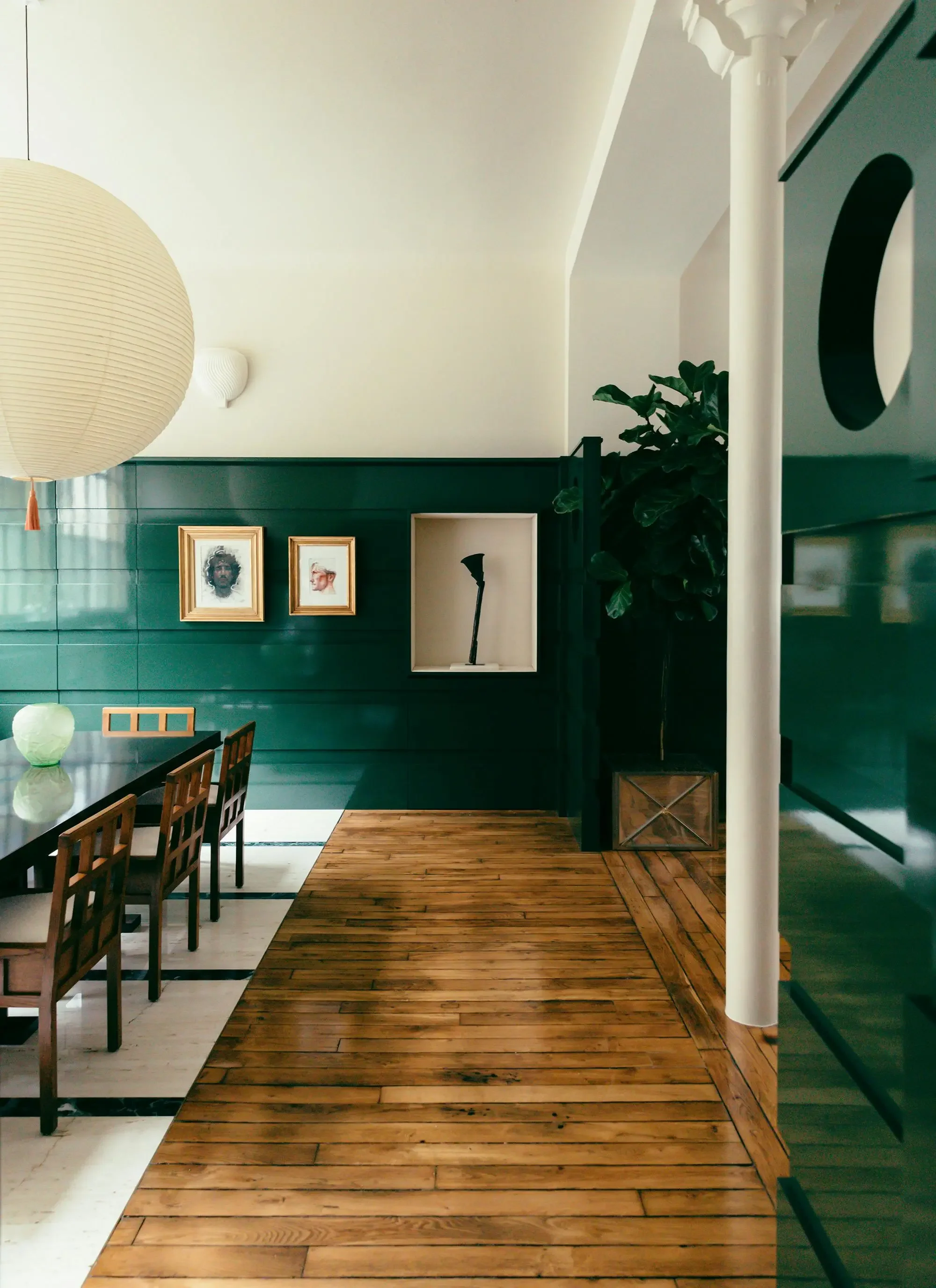
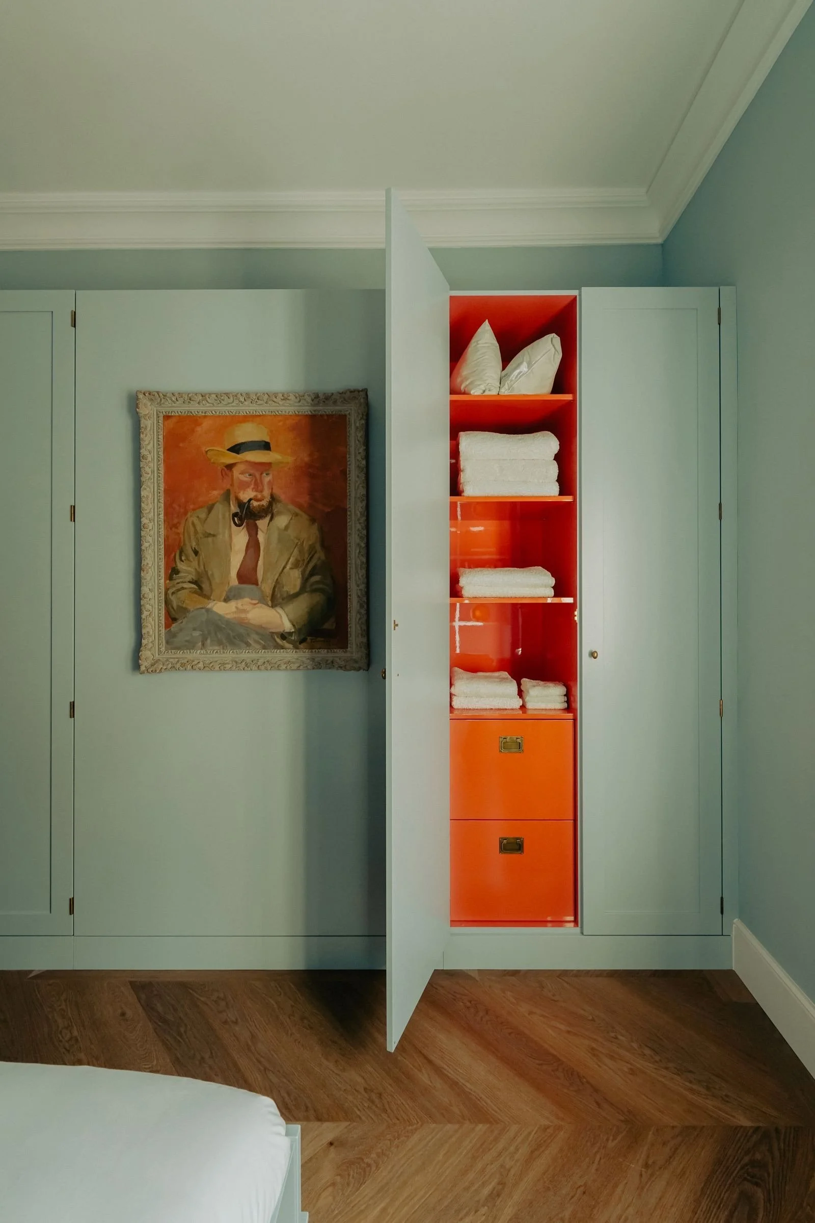
Take the unexpected red theory: a pop of red acts like a red lip—it ties everything together and instantly elevates the room. Red has energy, warmth, and psychological weight. Even just a lampshade or a piece of art can do the trick.

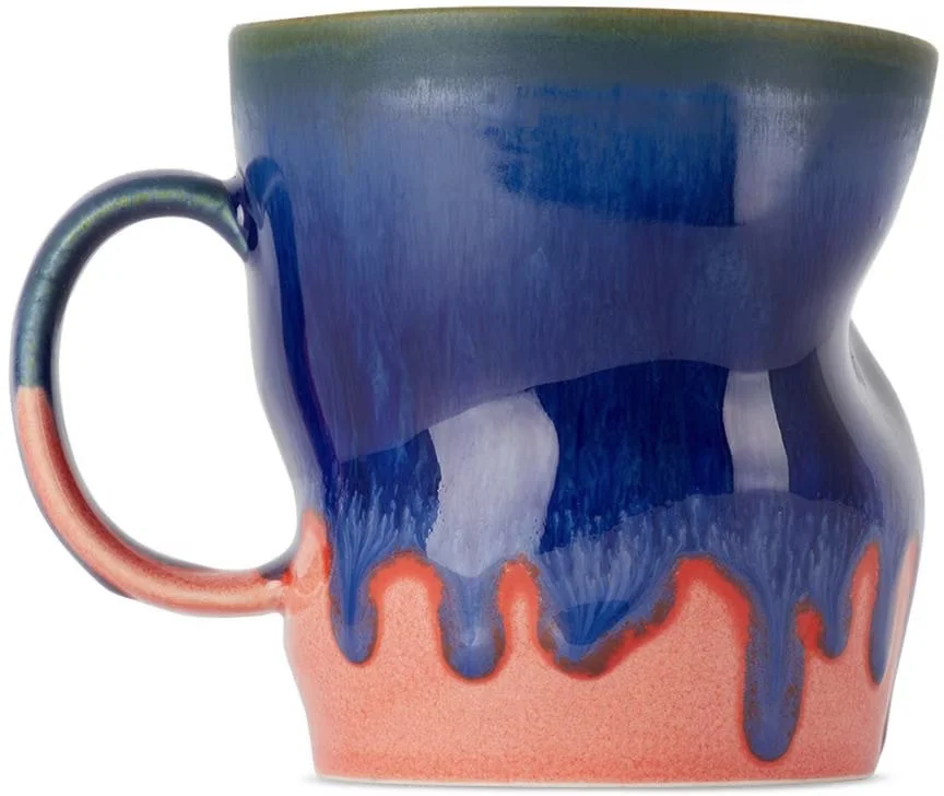
Complementary colors create contrast and cohesion in equal measure. Start with the primaries—red, yellow, and blue—and let their opposites guide bold, balanced choices.
When paired, complementary colors enhance one another—they create tension, vibrancy, and a kind of visual spark. But it doesn’t have to be literal.
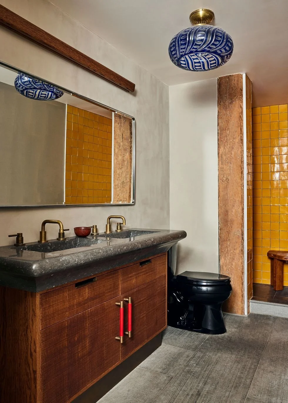
Skip the classic red and green and try a tangerine orange with a soft teal. The blue in the teal is balanced by the orange, and the red in the orange plays off the green in the teal. It’s subtle, dimensional, and endlessly more interesting.
And when you're working with neutrals, undertones matter. A gray can lean purple, blue, or yellow. A white might feel cool or creamy.
Always consider the undertone—especially when placing neutrals next to bold or saturated colors. A warm white next to a cool green will always feel a little off.

Great color combinations feel effortless, but they’re rarely accidental. It’s about contrast, cohesion, and just the right amount of tension. Do what feels right and be bold!
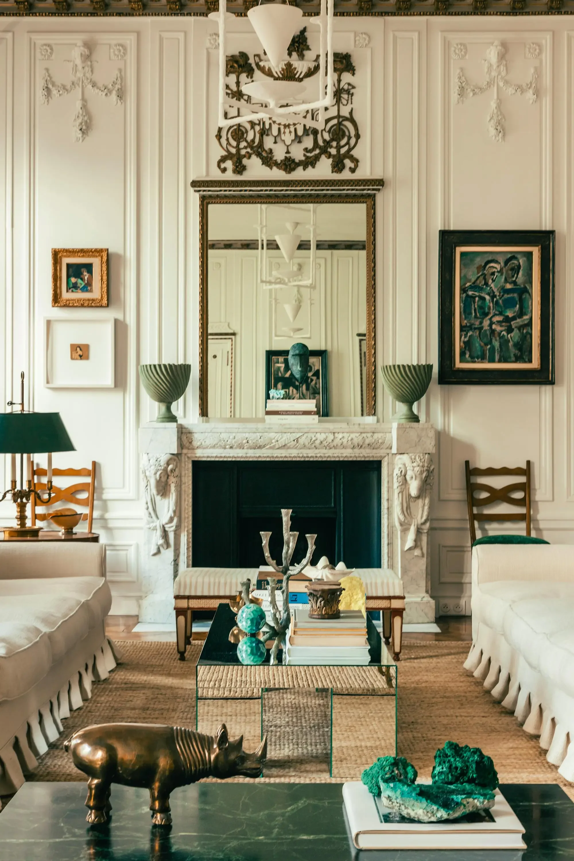
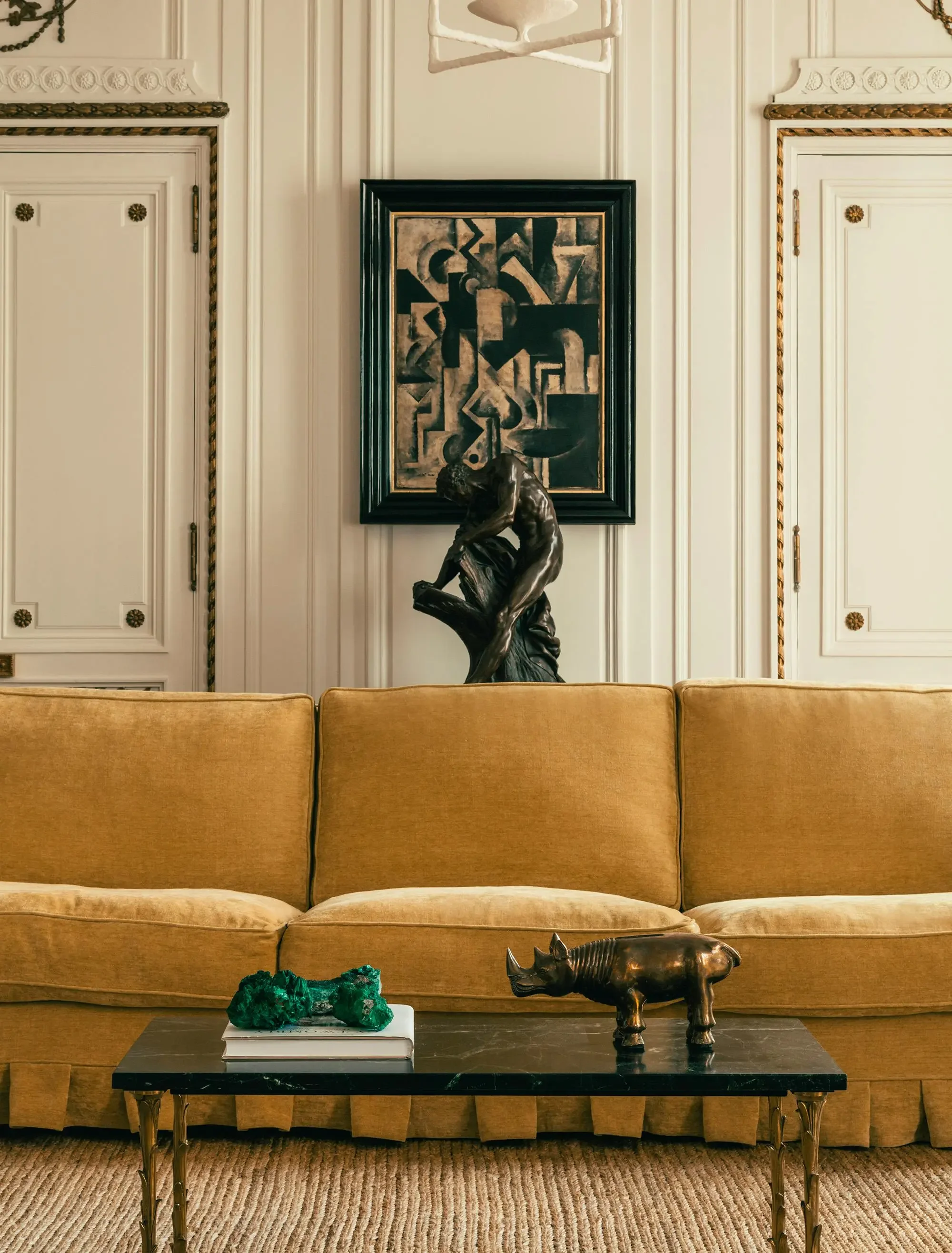
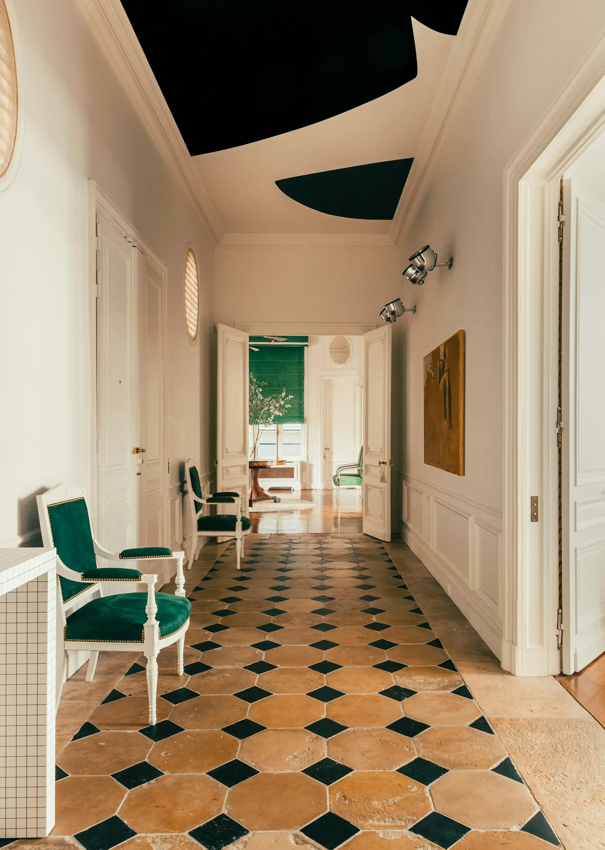
Project Highlight: Fabrizio Casiraghi Parisian Apartment
Fabrizio Casiraghi, celebrated for his refined eclecticism, transformed his own Paris apartment into a jewel-toned retreat that feels both intimate and transportive.
Drawing from 1930s silhouettes and layered global references, the space blends velvet upholstery, lacquered walls, and mirrored ceilings to refract light, shadow, and emotion. With antiques sourced from Naples to Jaipur, every detail reflects a worldliness rooted in restraint—proof that maximalism, when edited well, can be its own quiet luxury.