The Power of Contrast
This week we’re diving into one of the most impactful principles in design: contrast. Whether bold or subtle, contrast has the power to guide the eye, create balance, and bring energy into a space. It’s what makes light feel brighter against dark, textures feel richer when paired with smooth surfaces, and colors come alive when set against their opposites. Far from being just a visual trick, contrast is a tool that shapes mood and movement, turning ordinary interiors into dynamic, memorable environments. Understanding how to harness contrast—through scale, texture, color, and form—opens the door to creating spaces that feel layered, balanced, and full of personality.
This weeks finds (click item to shop)
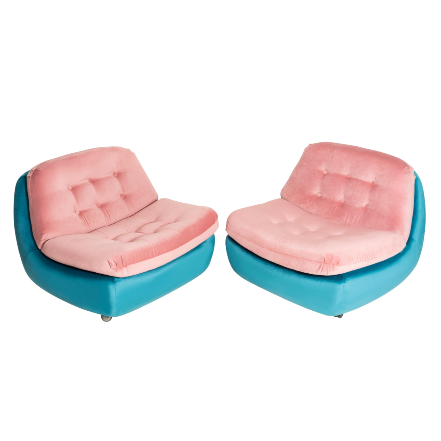


Contrast in design is all about balance and drama. It’s the deliberate pairing of opposing elements—like dark vs. light, rough vs. smooth, modern vs. vintage—to create visual interest and depth.
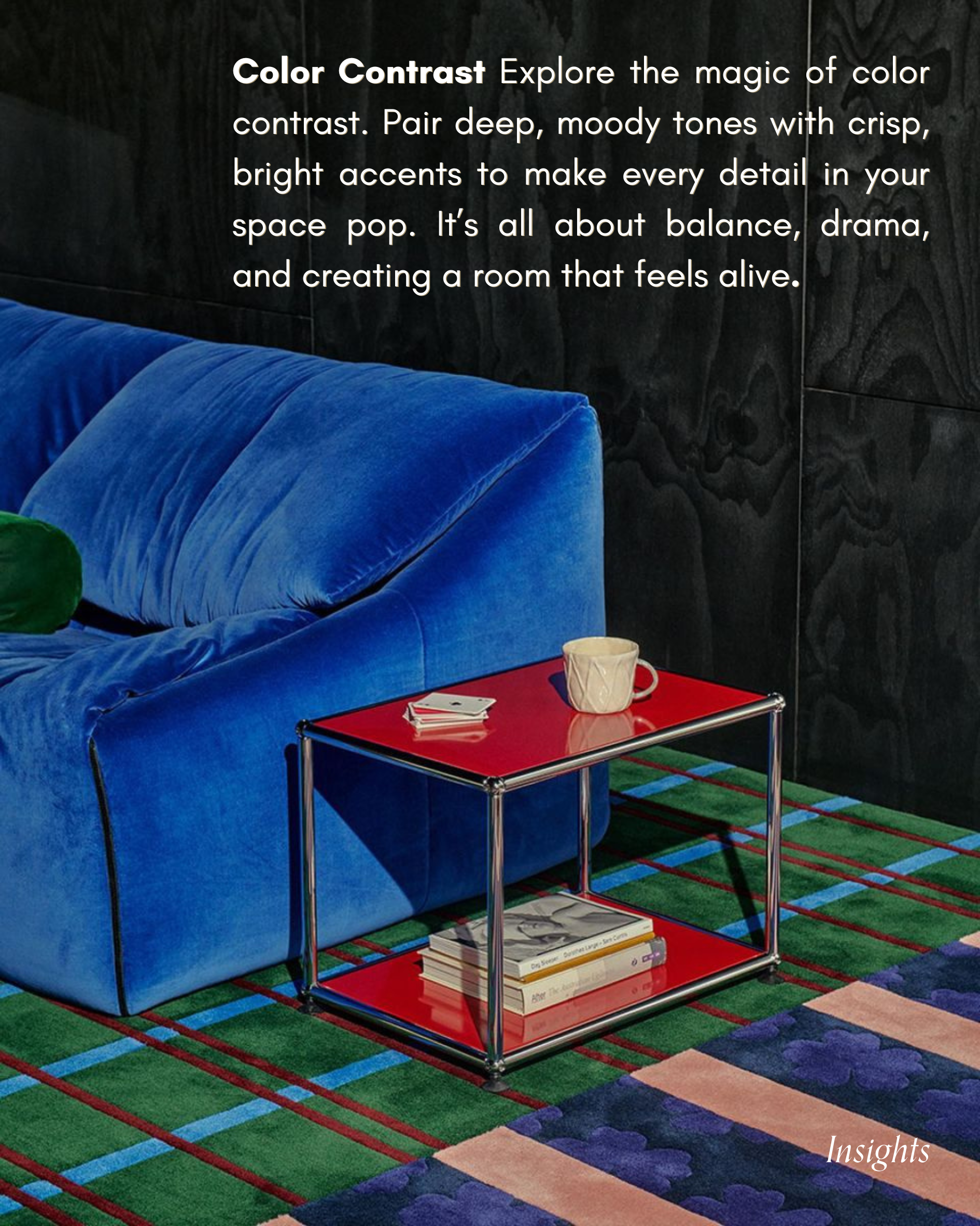
Texture Contrast Pair smooth, velvety fabrics with raw, weathered woods to create a space that feels both rich and grounded. It’s all about depth, character, and layering touchable materials that bring your room to life.


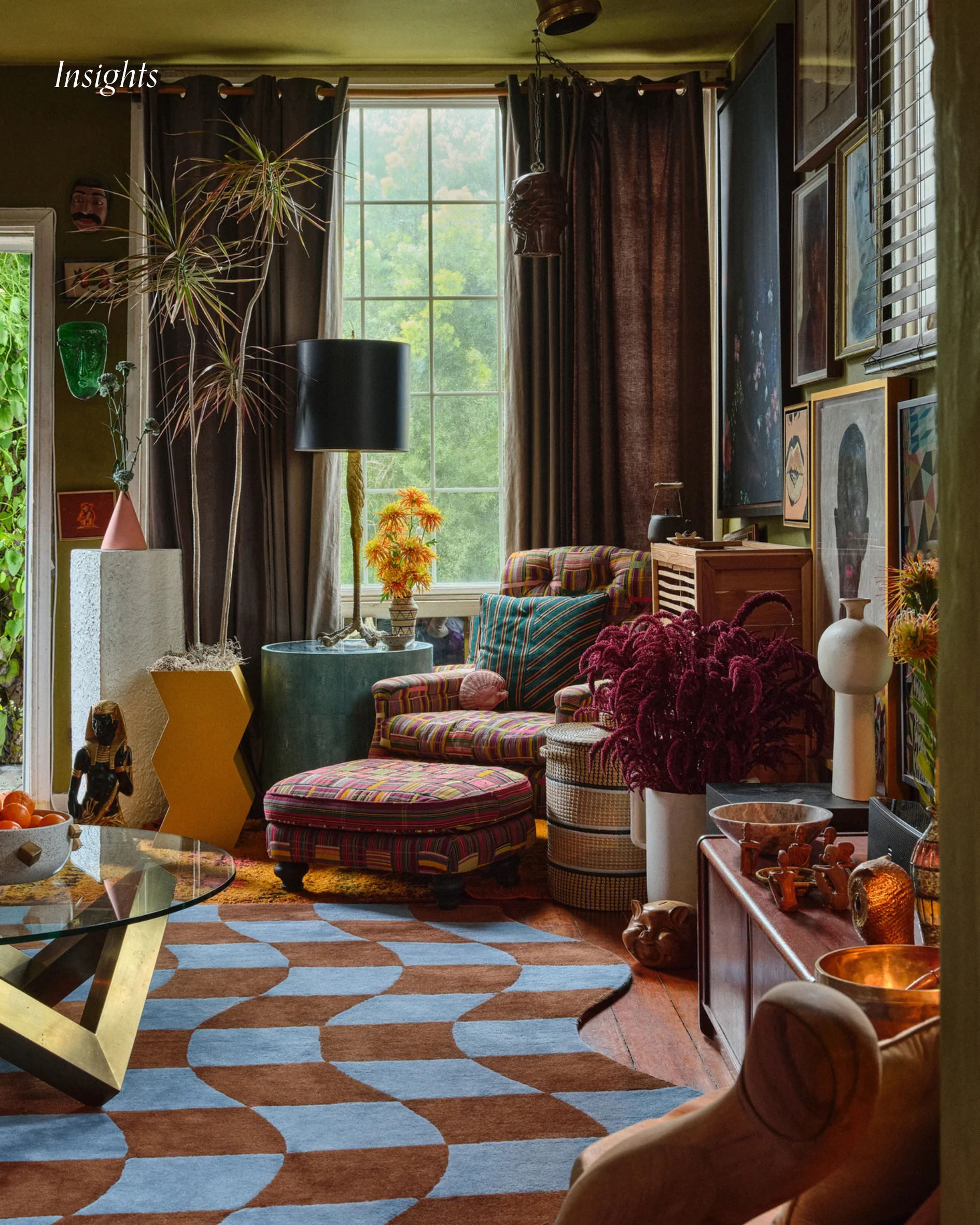
Style Contrast By blending design elements from different eras or aesthetics— you create a space that feels curated rather than uniform. Contrasting styles highlight each other’s unique qualities, making both stand out. This approach breaks predictability and invites a layered, personalized feel into the room.
Pattern Contrast Layering different patterns—stripes with florals, or geometrics with abstract prints—can energize a space when done thoughtfully.

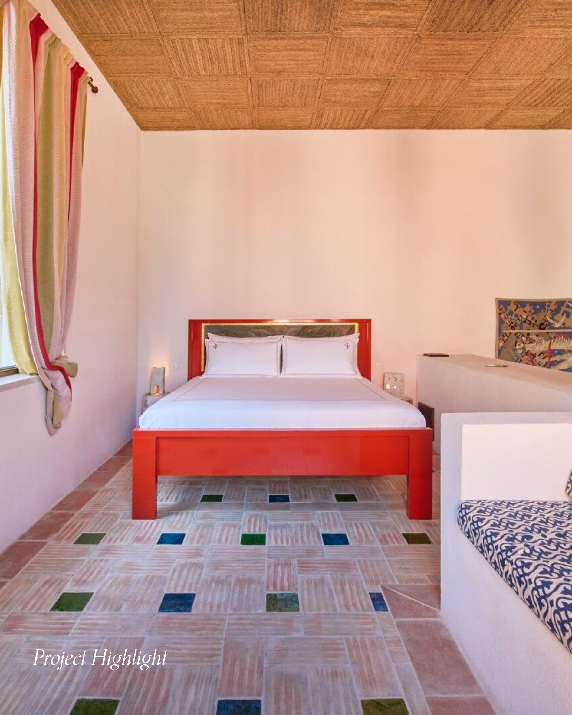
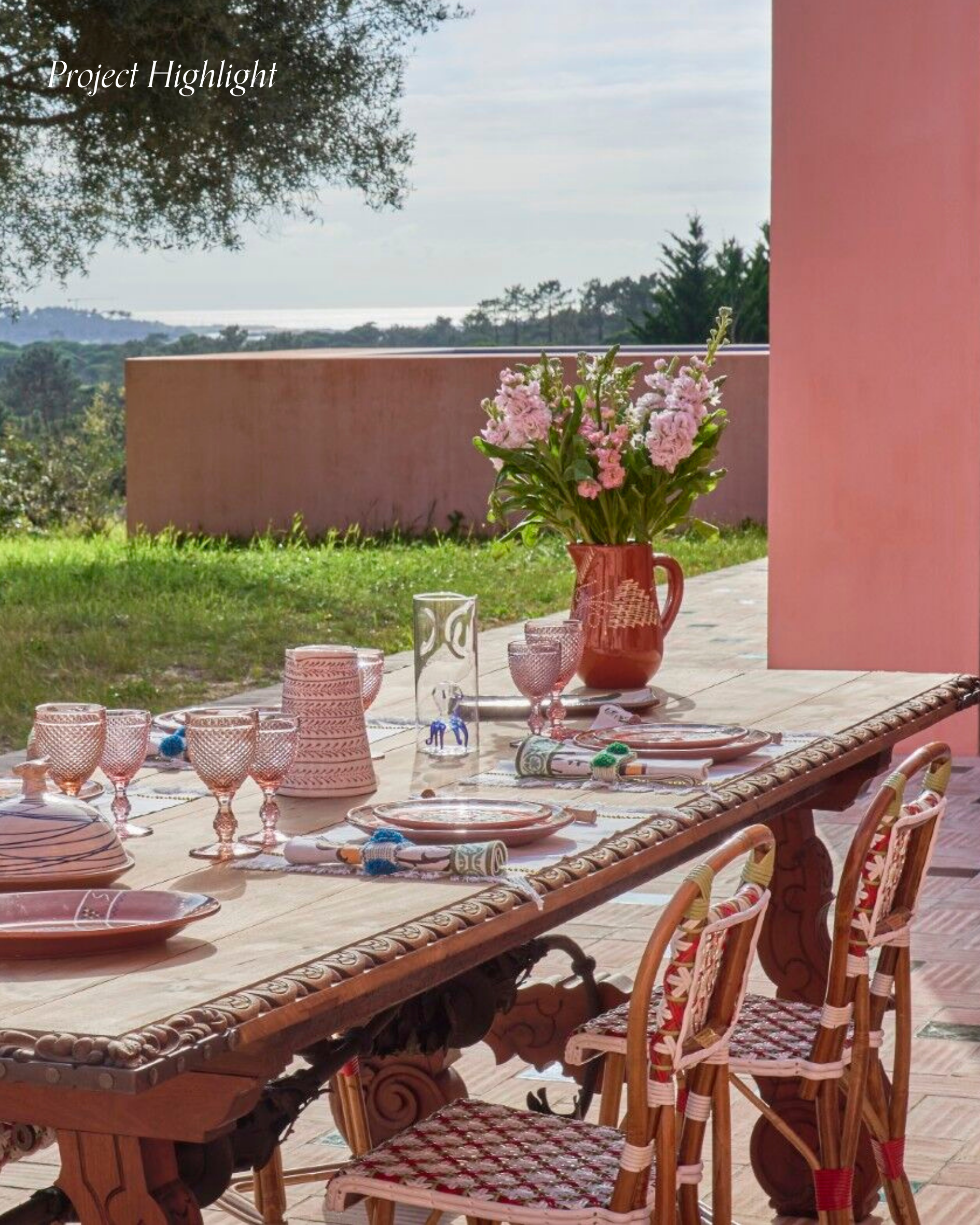
Project Highlight: LA SALVADA Christian Louboutin
La Salvada’s interior blends serene elegance with authentic flair. Bathed in natural light, its warm, inviting spaces feature curated textures, bold accents, and an effortless sense of calm. Thoughtfully designed for comfort and reflection, every corner reflects Louboutin’s distinctive aesthetic.